
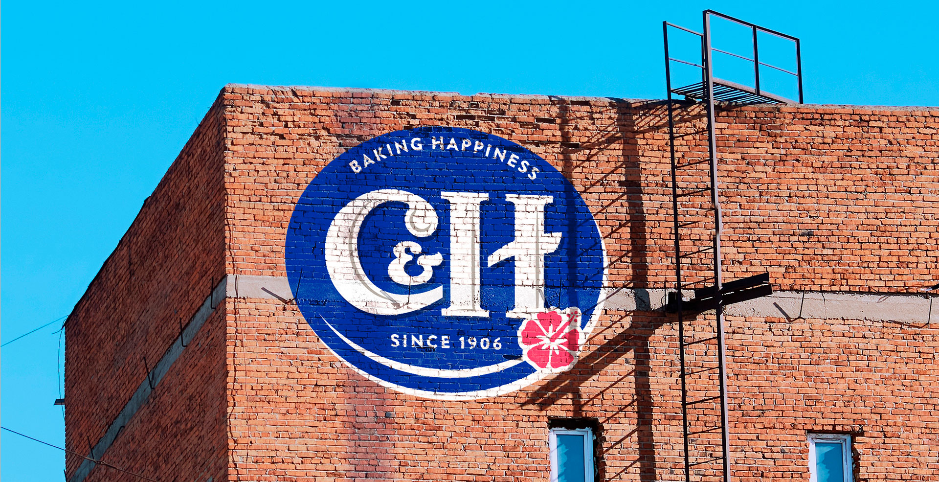
BAKING HAPPINESS
SINCE 1906
-
Client
- ASR Group
-
Teams
- Packaging
- Illustration
- Artwork & repro
- Creative Roll Out
- Design
- Brand Strategy
- Research
-
Office
- Chicago
-
Sector
- Food & Drink
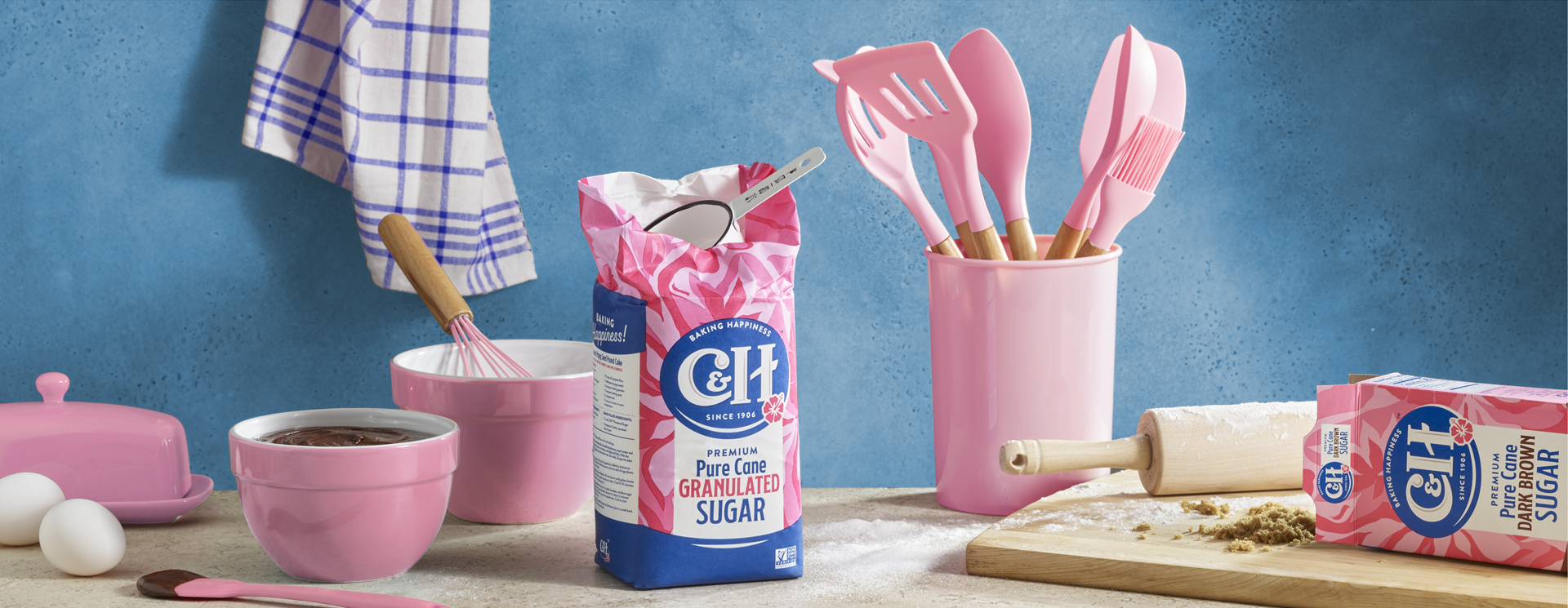
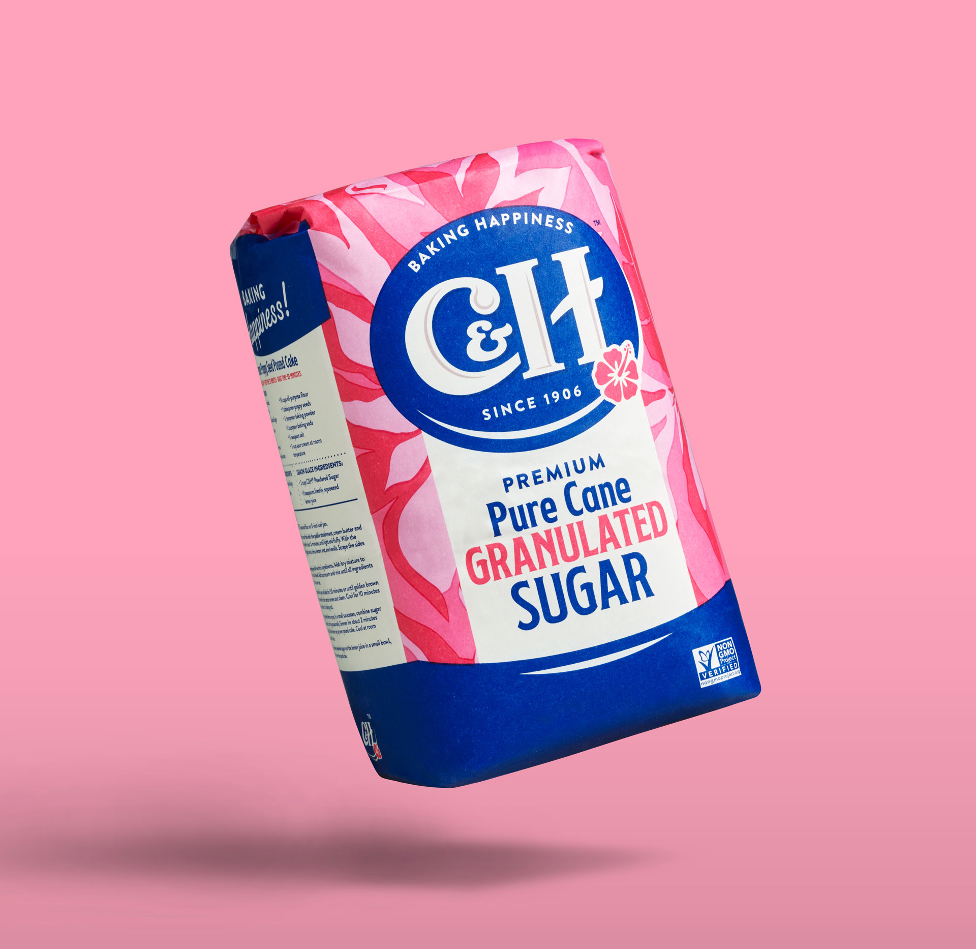
ASR Group’s redesign of its West Coast sugar brand, C&H Sugar – unchanged since 1906 – called for a delicate mixture, combining the traditional yet timeless pleasure of baking with the brand’s more modern aspirations.
REPOSITIONING THE BRAND
CELEBRATING
CELEBRATING
LIFE’S SWEETESTMOMENTS
Our team began with a thorough exploration of the category, prompting an emotive creative concept based around the joy of baking.
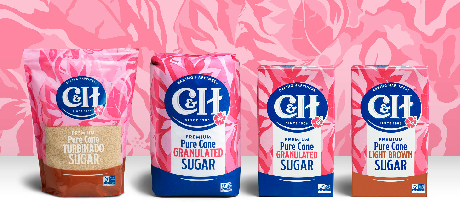

MIXING IN A TASTE
OF THE TROPICS
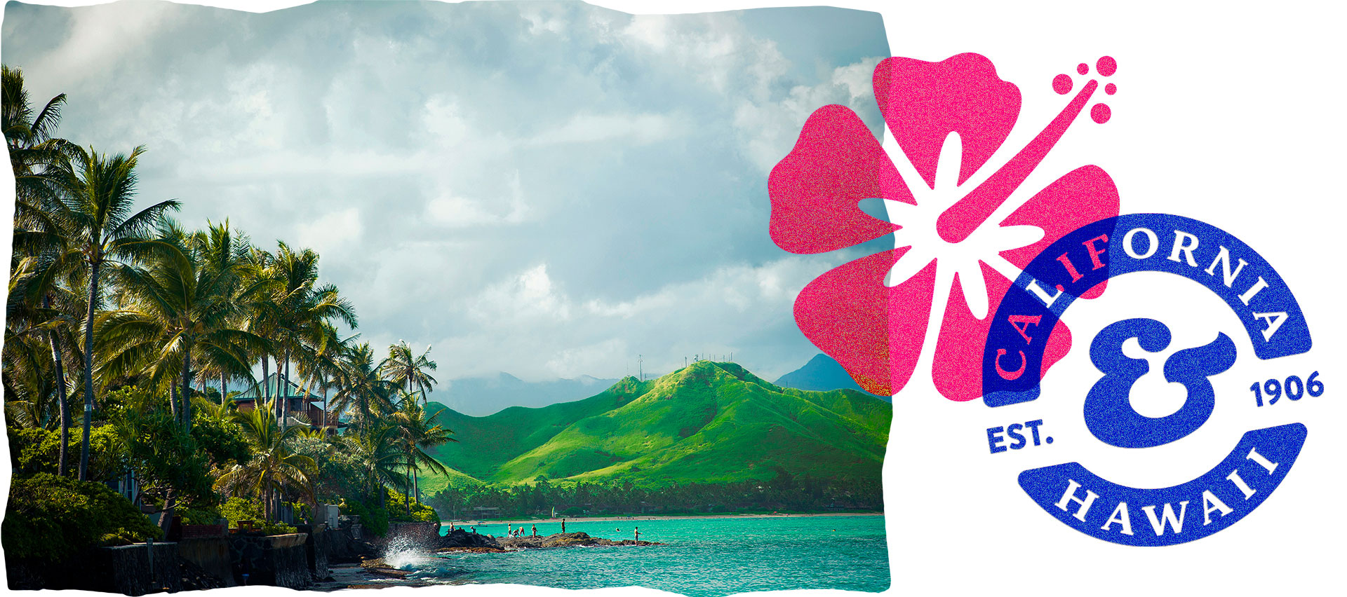
Origin was important, as the name C&H was derived from the states of California and Hawaii (where the sugarcane was originally grown and harvested). We carried over the hibiscus from the old logo to keep the tropical aesthetic, while our in-house illustrators developed a lush but uplifting botanical background in the brand’s signature pink.
A new look for an old favorite
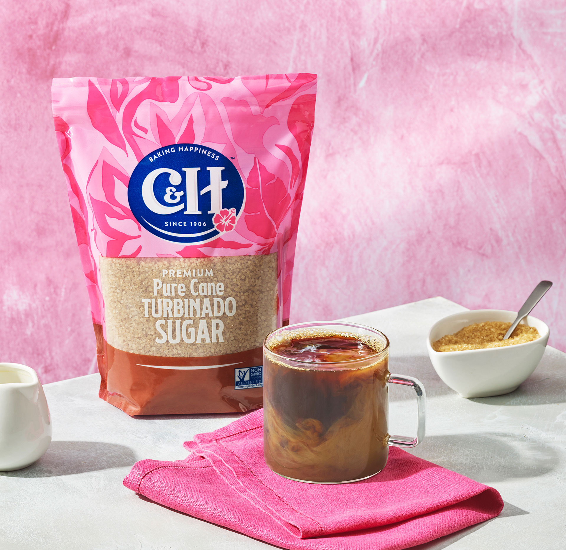
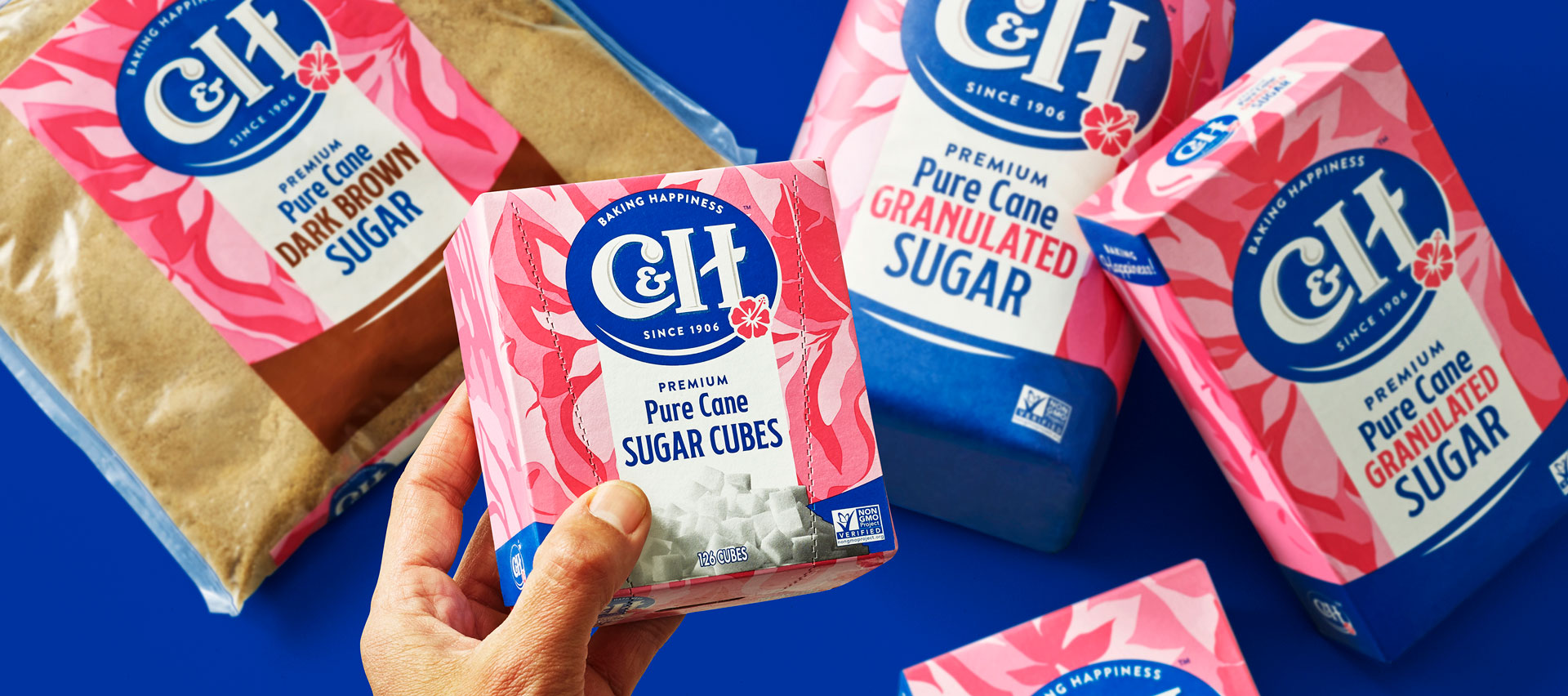
The final design breathed new life into this pantry favorite, highlighting its tropical origins and communicating the simple pleasure of baking. By comprehensively researching category and consumer, we ensured that when it came to C&H’s consumer base, the baton could be handed seamlessly from older generations, to Millennial parents, and Gen Z shoppers.
GET IN TOUCH
Have a new project in mind?
We would love to hear about it.
General Enquiries