SCHNUCKS GRANOLA
-
Client
- Schnucks
-
Teams
- Packaging
- Photography
- Artwork & repro
- Creative Roll Out
- Design
-
Office
- Chicago
-
Sector
- Food & Drink
- Retail
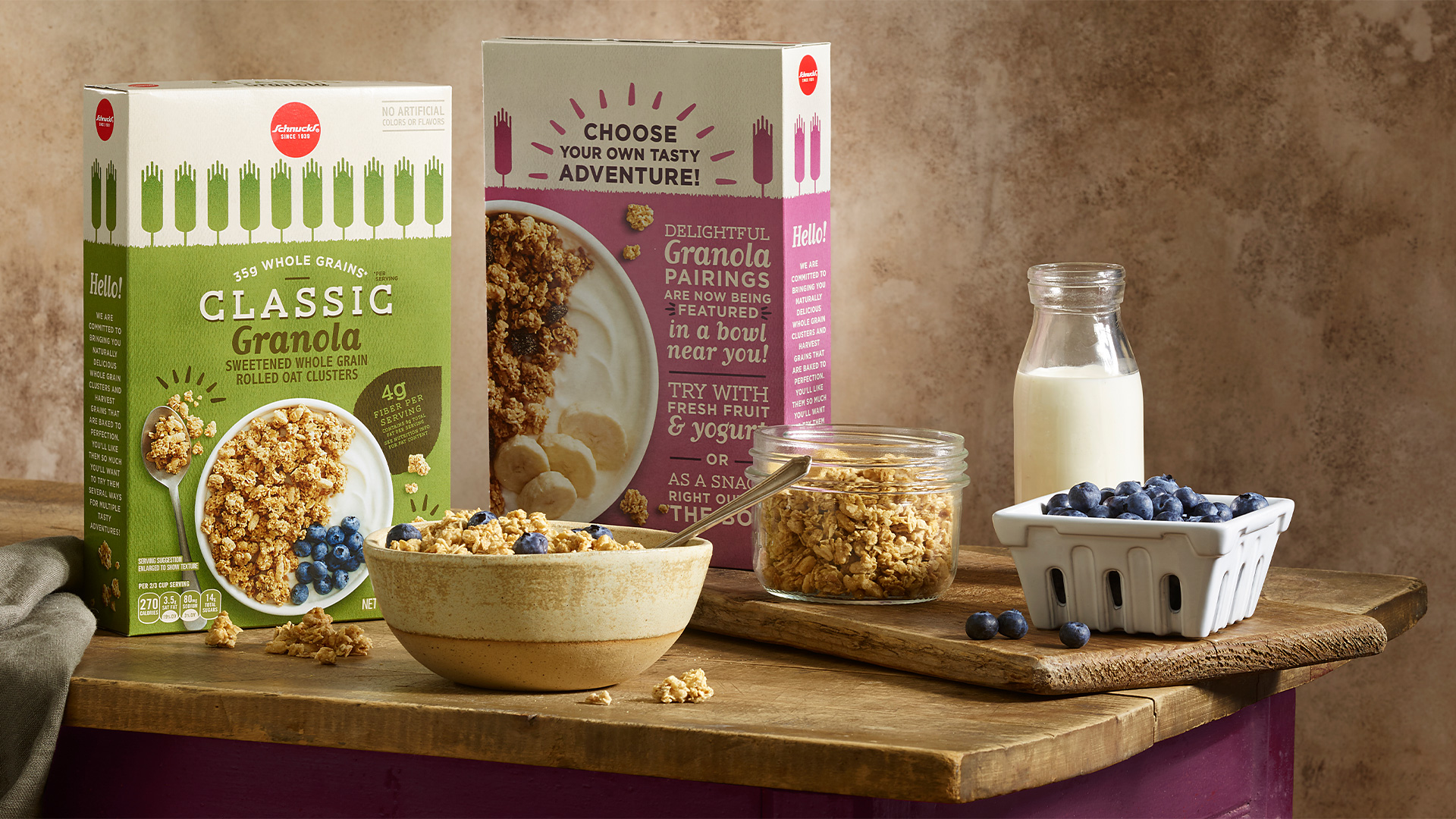
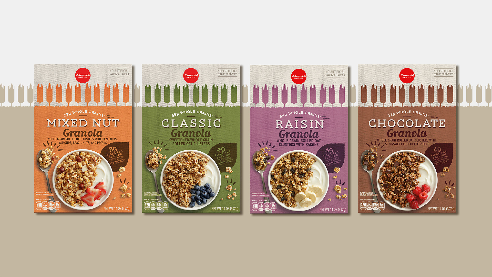
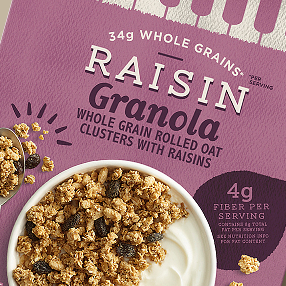
As a range that stands apart within cereal, the aim was to make a break from the wider category’s bright colors and graphics, for a more subtle look to highlight authenticity. Every element underscores the health-oriented qualities found within, from the earthy hues which correspond to individual flavors, to the grain icons across the box top and the leaf-shaped callout.

GET IN TOUCH
Have a new project in mind?
We would love to hear about it.
General Enquiries
