CLARITY OF DESIGN
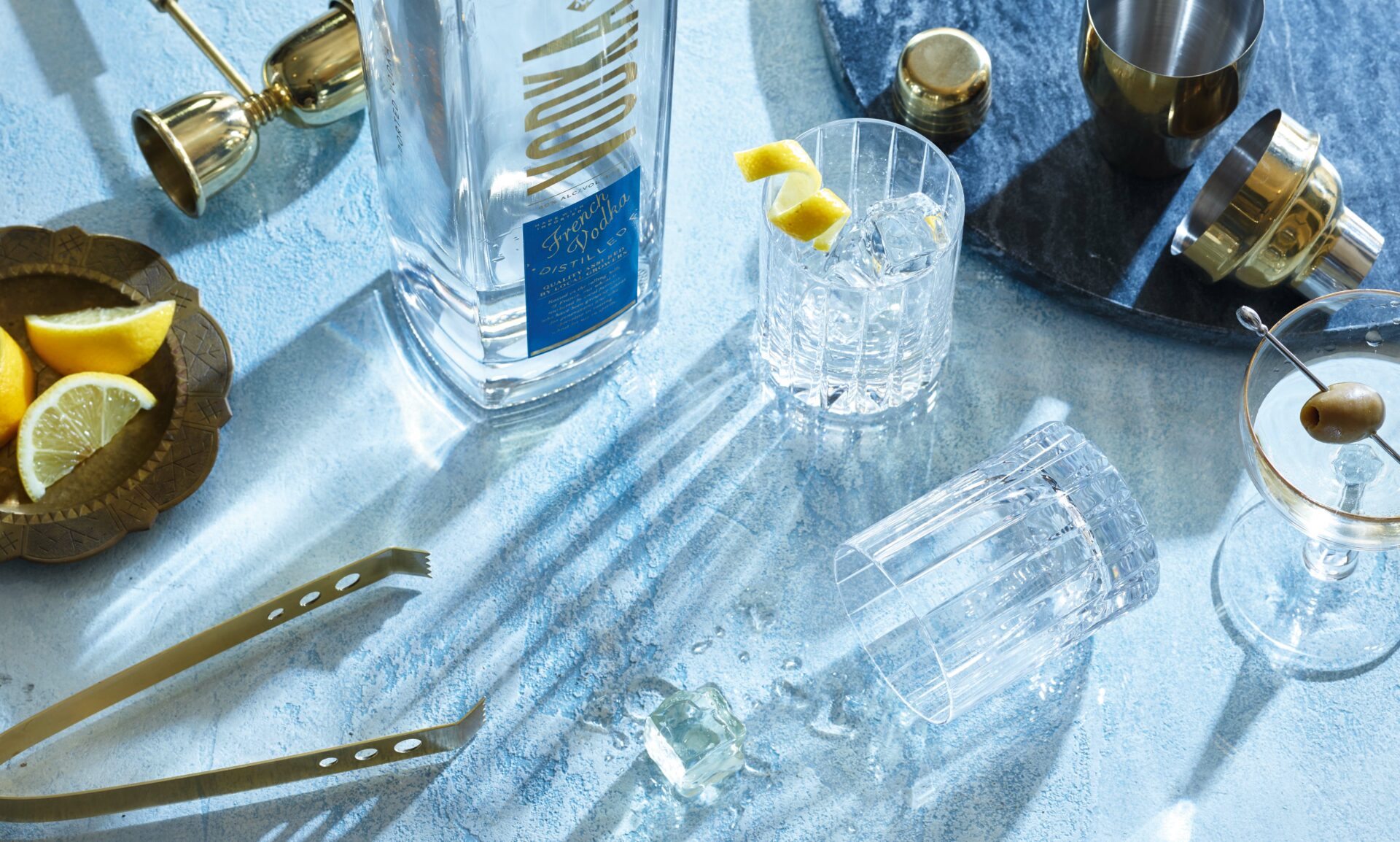
With vodka lending itself to treatments that evoke clarity and ice-cold cool, the design needed to leverage see-through elements of the bottle, while pulling through traditional design cues with a contemporary twist.
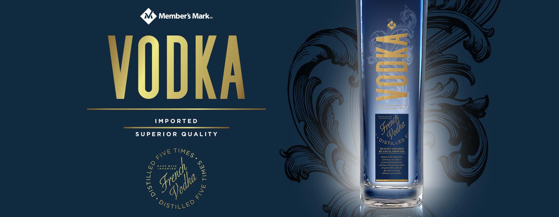
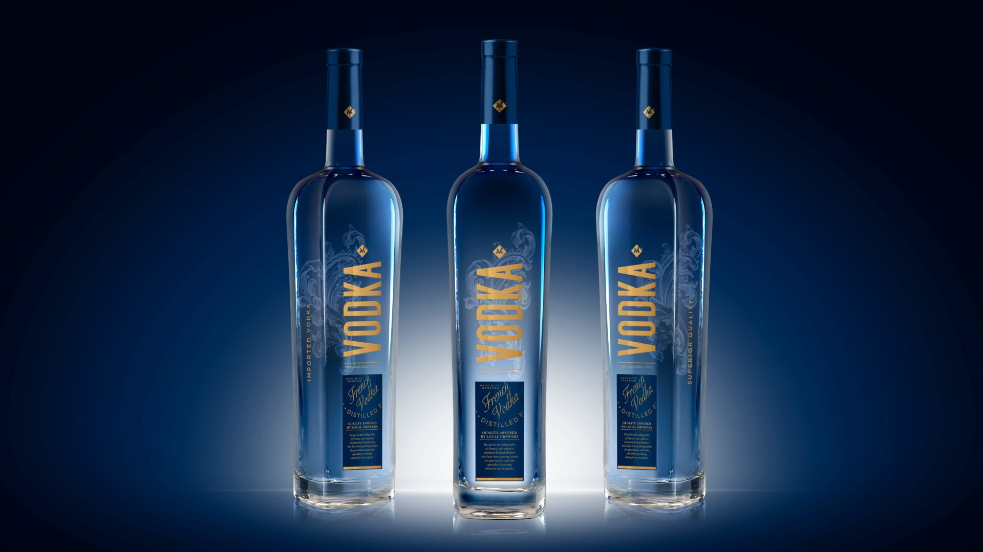
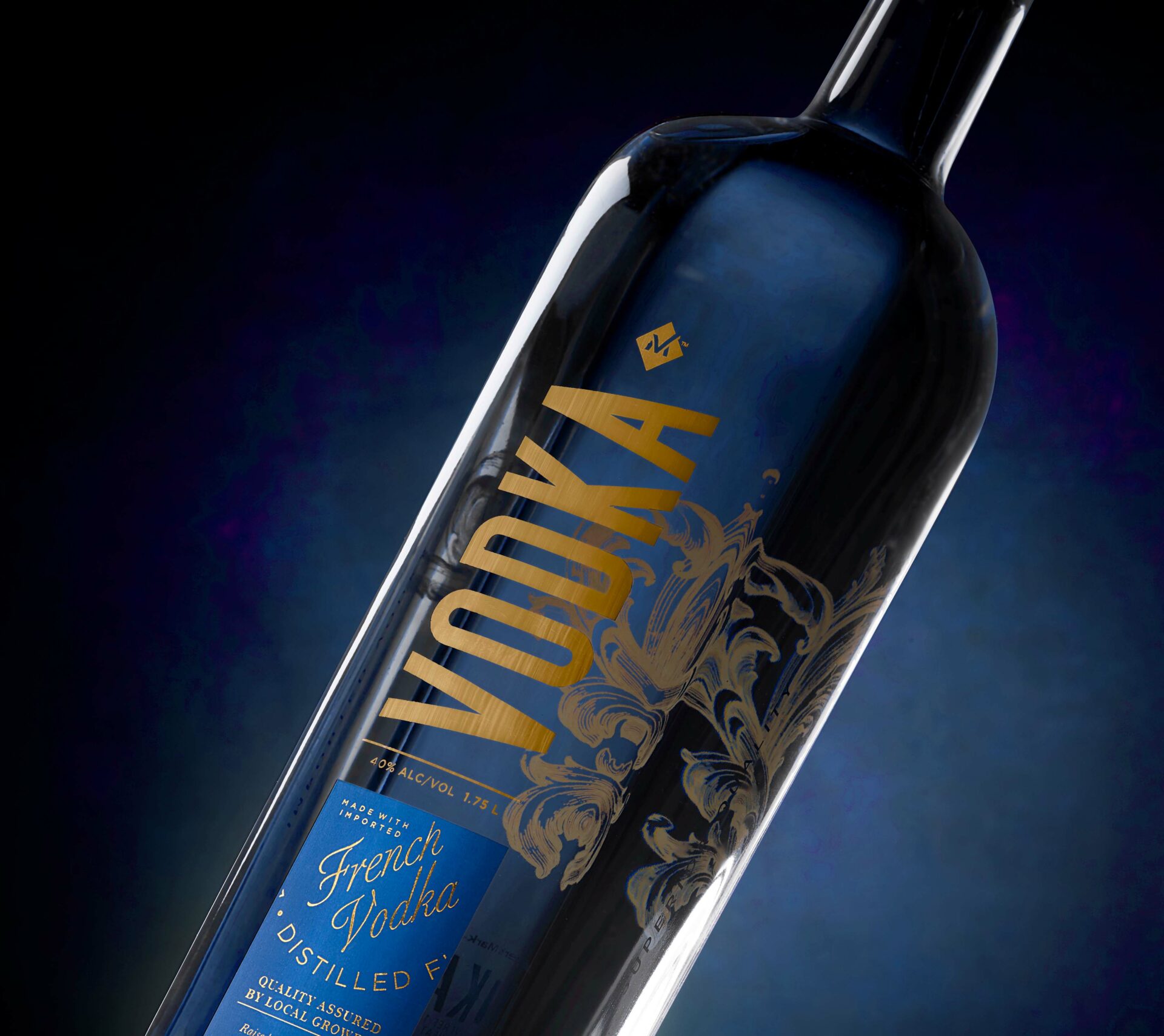
A new premium 1.75L vodka for Sam’s Club: Member’s Mark, this design needed to be relevant to the category, drawing inspiration from established premium brands while subtly communicating the product’s French provenance.
With vodka lending itself to treatments that evoke clarity and ice-cold cool, the design needed to leverage see-through elements of the bottle, while pulling through traditional design cues with a contemporary twist.
Traditional with a contemporary twist
The Equator team delivered a sleek, contemporary bottle, with opulent, bold lettering to proclaim the word ‘vodka’ topped by an ‘M’ insignia for the private brand. With a French navy label providing a subtle hint of provenance and gold script, the bottle references category norms while delivering impactful classic yet contemporary chic. An etched fleur de lis-inspired motif completes the elegant styling, appearing to float inside the bottle.
Have a new project in mind?
We would love to hear about it.