Toronto’s Tracey Ujfalussy talks team-building, strategic thinking, and front-of-pack nutrition labelling
Our Toronto studio has been busy working with North American clients to prepare for Health Canada’s introduction of Front-of-Pack (FOP) nutrition labelling, which has a compliance deadline of January 2026 and requires packaged foods high in saturated fats, sugars, and/or sodium to carry a specific symbol on the front of their packaging. This amendment to the Food and Drug Regulations has pushed brands to amend their packaging, with many taking the opportunity to carry out a full-scale redesign. This is something Design Director Tracey Ujfalussy knows much about, as a handful of clients have already approached the studio with this ambition in mind.
We sat down with Tracey not only to explore how brands are grappling with the FOP requirements, but also to chronicle some of the achievements she’s enjoyed during her 26-year career within the SGK family.
Hi Tracey. Can you tell us about your role as Design Director? What are your main responsibilities?
I attend briefings with the account team, making sure we get the information the creatives need, working with various designers, and then presenting that work back to the clients. For me, it’s about seeing every brief as an opportunity for fresh ideas – not just to meet expectations but to expand them. Part of my role is to challenge our creatives to push boundaries so we can inspire our clients to embrace new pespectives. Sometimes this means providing strong rationale for exploring ideas beyond their initial vision and showing how these choices can amplify their brand in ways they hadn’t anticipated. My job is to bring this level of inspiration and open up a view into what’s truly possible. Outside of work, as anyone in the business will probably agree, every shopping trip for groceries is a long one, as I’m constantly checking out each aisle to see what’s new and exciting on-shelf, as well as in-store. We do a lot of point of sale (POS) work, so staying on top of the trends is very important. I believe my phone has more grocery store photos than it does family photos.
And in terms of developing your team and the performance of the studio, what have you been focusing on?
I’ve been concentrating on my relationship with my team members. I want to champion our designers, so I’ve been taking time to learn more about them and their individual skillsets so we can utilize their strengths and true talents. I try to inspire them – to look ahead and grow their strategic thinking. I want everyone to get out visiting stores more and identifying the opportunities they are seeing. To keep the entire team connected we do a monthly mashup celebrating the team members and our accomplishments. We showcase the projects we recently completed and encourage staff to give presentations on their interests. We’ve heard about all sorts of hobbies, from hidden talents and travel to marathon-running and fly-fishing! We really are a tight-knit group and appreciate each other’s similarities and differences. We are planning to do more in the future, like creative safaris that get us inspired and get us thinking outside our four walls.
The Toronto studio has been helping clients prepare for the introduction of Front-of-Pack (FOP) nutrition labelling. What kinds of approaches are you seeing?
It varies. One client has selected a batch of products to see how the front-of-pack claim might fit. We’re working with them to come up with standards for its placement, which is more about adapting their current design to accommodate the label in the least disruptive way. Another client has asked us to redesign the whole pack, incorporating the label into our designs, which allows us to integrate the FOP and ensure their brand looks best on shelf while complying with the new regulations. What is concerning to me is that not many companies have addressed FOP nutrition labelling yet. I think no one wants to be the first out of the gate. They want to see what other CPG brands are doing. We’re only seeing a few things on shelf at the moment. This next year will be very interesting for sure.
Why is Equator best-placed to help companies with FOP nutrition labelling?
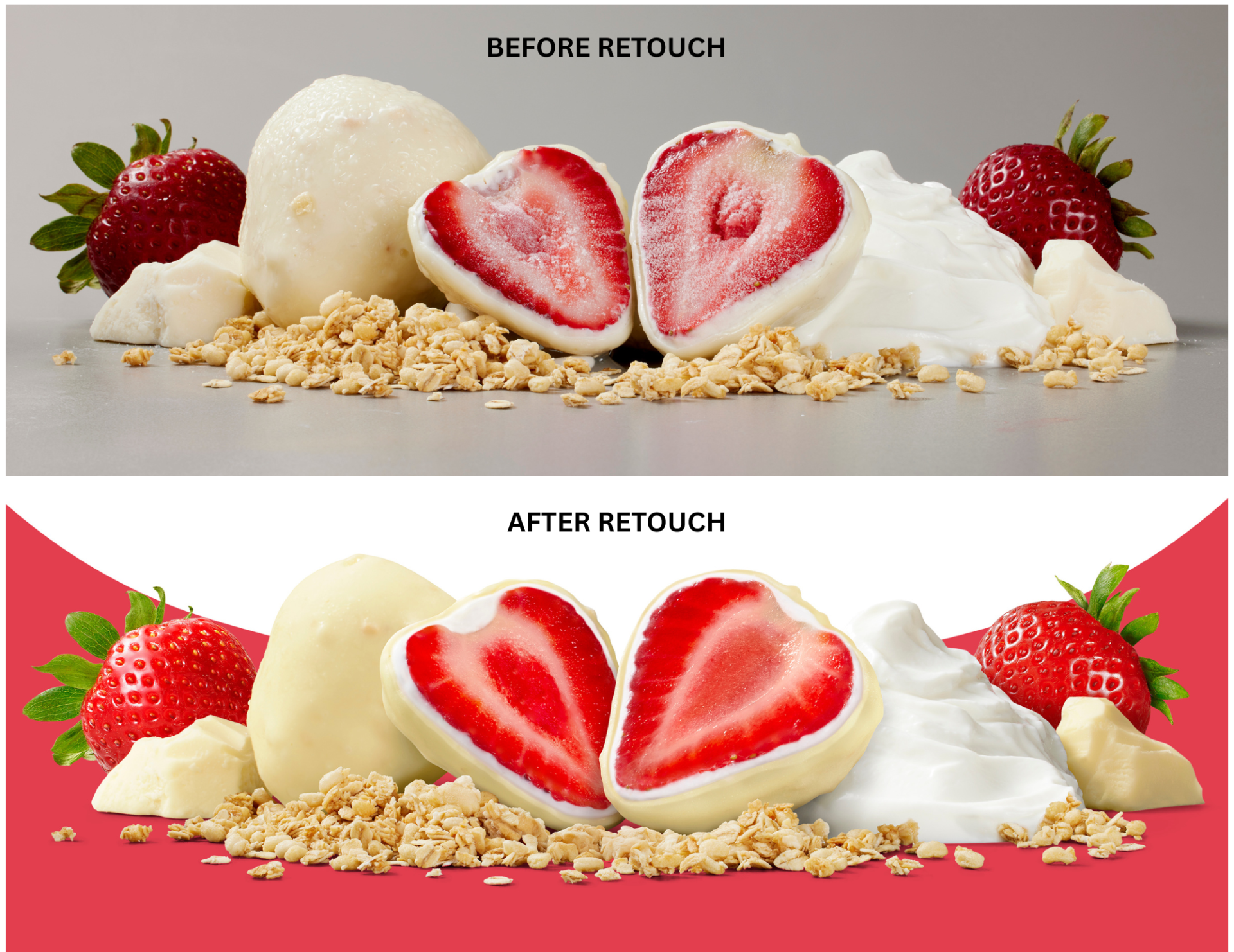
There are a lot of reasons. One is that we have people with the expertise and knowledge of the regulations. They’ve been working with the government right from the start and have connections to clarify anything that pops up. The expertise we have in this area allows us to create a seamless integration legally and a holistic application using strategic design. This is enhanced by the strength of our creative team and ability to use our global teams in the rollout. We also have great strength in areas like photography, which we can utilize to help elevate these projects, so I’d say Equator definitely opens doors for a lot of reasons.
Helping clients navigate challenges like these is clearly something you excel at. What else do you love about your job?
Branding and packaging is my passion. I’ve been doing it for over 35 years, and I’ve loved it from the start. I enjoy teaching and seeing the people around me grow and get satisfaction and happiness out of what they do. Being able to be a helping hand and ear to my coworkers is something I really value.
Looking back over your career at Equator, are there any projects that you’re particularly proud of?
Definitely! Kellogg’s asked us to create a heritage pack for Rice Krispies, Corn flakes, Fruit Loops, and Frosted Flakes to celebrate Tony’s Anniversary. We looked back at their packaging archives, along with research from graphic styles from the 70’s, 80’s and 90’s, and then created a series of concepts in a cool retro style that would attract today’s consumer. That was so enjoyable to work on, especially having characters redrawn in the old style and doing effects on the board to make it look older. It’s something we don’t get to do every day. We had the opportunity to refresh the entire Cereal category for Kellogg’s which was a lot of fun, but took over two years to complete. It’s what is on the shelves now and we are all proud of that work. I have also really enjoyed some of the POS projects we’ve done – the process of making our ideas come to life in a 3D mind-set. I get a big kick out of that!
And looking forward, what do you hope the future holds?
The opportunity to work with and learn with designers from around the world. One of the things the leadership team has done recently is to create a buddy system. I have a few buddies in Manchester and one in West Michigan and we connect every two weeks or so to talk about what is new, what we are working on and just sharing ideas. That connectivity between the different locations is so valuable. I would love to see more of it.
To learn more about FOP labelling requirements and how they might affect you, contact our Toronto team on +1 905 219 1600 or email us at hello@equator-design.com