Bringing home the bacon: the importance of brand and packaging in food retail.
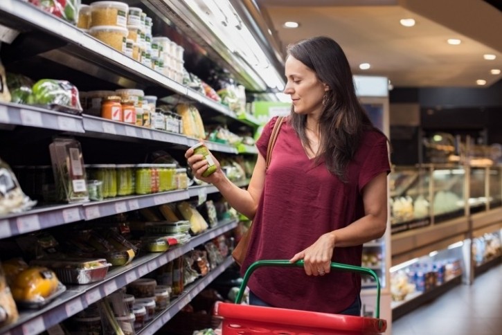
What is it about packaging that makes a consumer pick one product over another? For specialists, such as consumer psychologists or design and brand strategists, for example, we know the subtle intricacies that can influence and motivate a shopper, but for the average consumer, it’s unlikely to have been given much consideration. They’re just naturally drawn to something – often an emotional response as much as a conscious choice.
For Co-op, a brand with care as part of its DNA, that same level of ‘honest to goodness’ attention goes into the design of each product a customer sees in store. This was the theme of a recent talk given to Co-op employees across the entire business – from finance to Co-op Funeralcare, from food to pharmacy – shining the spotlight on the importance of packaging and brand and giving employees a sense of pride in the detail.
Our senior creative director, Glyn Robinson, delivered the talk to an engaged room as part of Co-op’s ‘Own Your Tomorrow’ series of speakers.
He says: “It’s a good reminder for me when I return to my roots in North Yorkshire, a traditional, rural community. I’m always inspired by the simple, relaxed and unspoilt world of natural produce, local food markets, homemade treats, farming, village halls and a friendly community spirit – in many ways, a brilliant ‘brand’ without even trying – and one which retailers love to mimic in store”.
With 20 years of working with Co-op under our belt, the talk showcased what goes on behind the scenes at Equator to develop brand and packaging – and why it matters.
Here’s an insight into themes Glyn discussed in his popular talk:
The landscape:
The food market has matured. Customers have become savvy and seek out both quality and value. Artisan producers, food markets and independent delis offer delicious, crafted products so it’s increasingly important for food retailers to understand this language and offer something special to stand out.
The beginning:
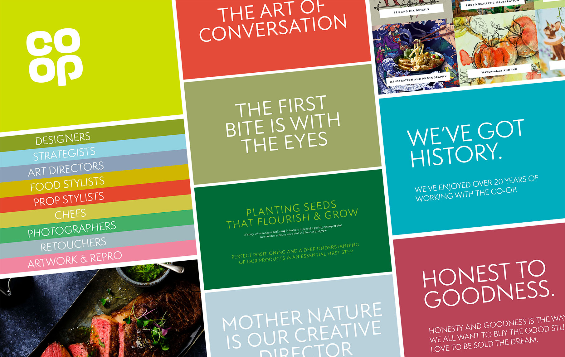
The team and expertise is vast – strategists, stylists, photographers, artwork, designers – but we’re only as good as our insight. As a team, before we even begin, we develop a deep understanding of the product – what makes it special? Why should customers care? It’s only when we’ve dug deep that we can develop something that can flourish and grow.
Glyn says: “We know the love and attention that goes into each Co-op product. It’s our job to tell that story on every single piece of packaging.”
The trends:
There’s a world of inspiration that can influence design. Inspiration can be found in gourmet retailers on the continent as well as independent patisseries, fromageries and vintners. There’s also a World of inspiration closer to home, from both the large retailers and the traditional independent local shops. Glyn shared the importance of seeking out inspiration, which can come as much from the traditional tiled wall of a local Butchers as it can the new brands and ranges of the big retailers.
The design:
An assimilation of landscape, trends and product begin to create a tone for the design. What do we want it to say to us? Is it artisan, luxury, reliable, traditional, on-trend, collectable? From here we explore how to set this tone on pack.
When you look across the gourmet retailers and delis, you can see that premium is changing. Premium now has an ‘honest to goodness’ tone – whether that is products that are unwrapped or visible through a window to let the product do the talking. The ‘small batch’ cues of artisan delis, for example, are pared back and simple.
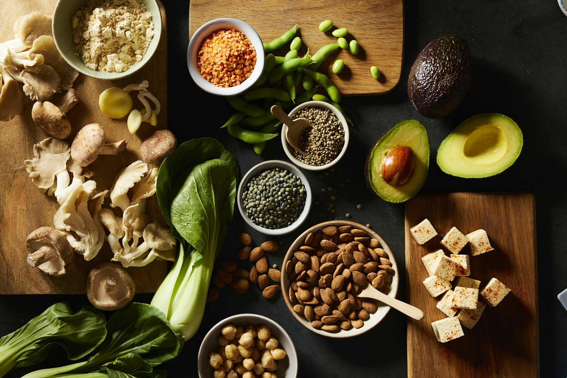
Glyn adds: “Mother Nature is our creative director. Where the food speaks for itself, why would we want to cover it up? When we have beautiful produce, fresh leaves, golden crusts and tasteful toppings, we can use product reveal to create naturally beautiful backdrops for our packaging.”
Where the product in its raw form isn’t appealing, such as a ready meal for example, this is where we rely on photography. They say the first bite is with the eyes, and food photography is an art form that can be incredibly effective in setting tastebuds tingling. When it’s done well, on-pack photography speaks volumes.
The palette:
Glyn says, “Colour is so emotive and so important. We’ve often avoided Pantone colours and, once again, let Mother Nature inspire the palette.”
Using nature-inspired colours, such as a bright apple red, or a warm, rustic colour of a freshly-baked loaf, enhances that tone of natural goodness. Glyn refers to the ‘Farrow & Ball effect’ where colours such as slipper satin or skimming stone have an aspirational quality that draws people in. Glyn adds, “It’s these nuances that sell the dream…. and sell the product.”
The details:
The language on pack needs to speak to consumers like you know them – appealing to their wants and needs. Whether that’s an appeal to their humorous side, to whet their appetite, or to make them feel special, words on pack create a dialogue, inspiring a conversation with the consumer, making them linger.
We’re looking to create feel-good food. That might also include packaging having a tactile nature – uncoated, natural stock and minimal print can feel just as good (if not better) than a host of foils, finishes and special effects. And of course, we absolutely have always got to now consider the planet we call home.
Glyn says: “We also love to draw from nature through illustration to give a product an exclusive, giftable quality – make it feel special. Lovely pieces of art on packaging can give the same warm feeling we get from finding a limited edition print in our local gallery shop”.
To summarise, Glyn closed with the thought: “We all want the good stuff and want to be sold the dream. Honesty and goodness are the way.”
