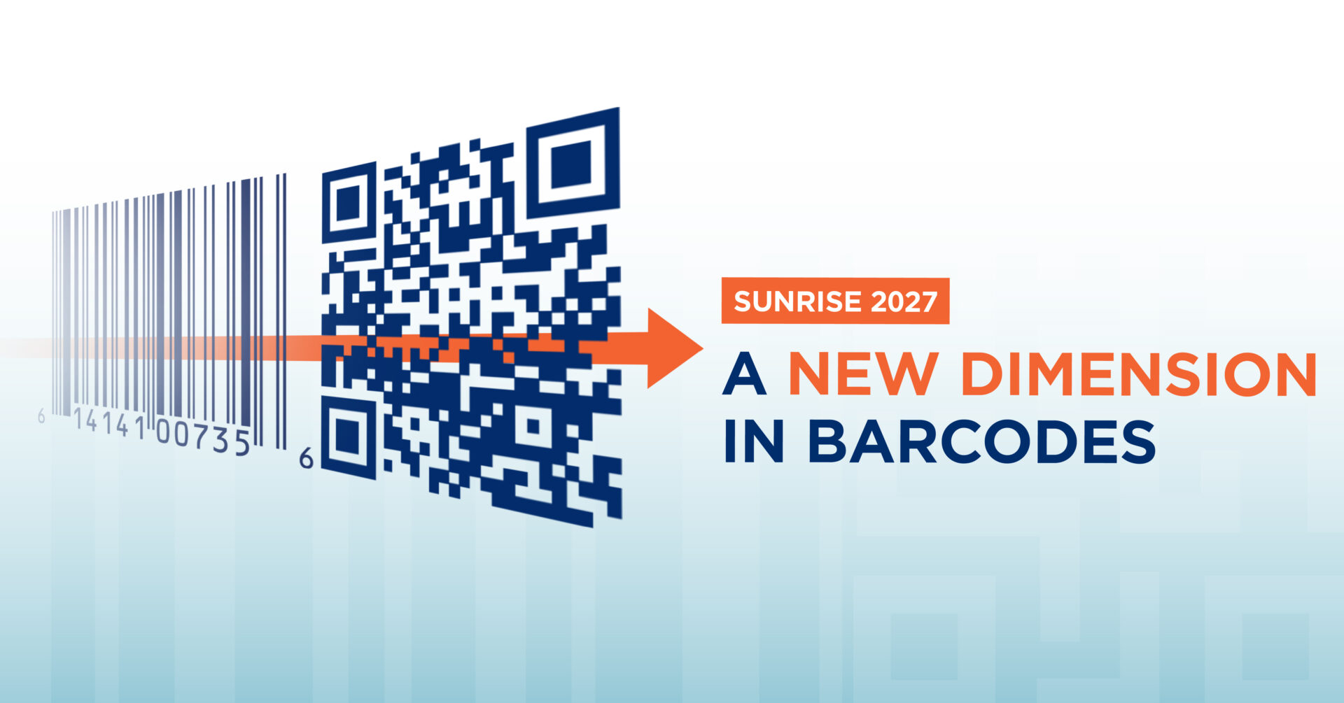
SIGNS OF THE TIMES: IS AN EVER-SHIFTING LOGO A METAPHOR FOR THE LIVES WE LEAD TODAY?
At Equator we talk a good deal about “locking in” a logo, and we often discuss the concept of future-proofing a logo or a range so that it will stand for a number of years.
Consistency is gospel when it comes to designing for brands… so why are some brands designing logos that are made to change, rather than made to last?
This was the dominant concept behind the recently unveiled Olympics 2028 logo. Made to reflect the “creativity and diversity of Los Angeles”, the logo is constantly morphing from one design to the next. With over 32 different versions (because why stop at 28?), each iteration of the “A” in LA has been created by a noteworthy individual – with everyone from Olympians to celebrities to entrepreneurs getting in on the act.
The long list of celebrities involved, including Billie Eilish, founder of streetwear brand The Hundreds Bobby Hundreds, actress and producer Reese Witherspoon and Paralympian Scout Bassett, are sure to give some star-studded oomph to early buzz around the event. Reportedly, some single-handedly created their designs, while others had help from the LA 2028 Olympics creative team.
Why create a continually shifting logo?
Well, because they can.
Thanks to digital media, there’s virtually no end to the number of assets and forms of expression a brand can create. LA28’s chief marketing officer stated that the logo was created for the digital age, and to appeal to the Gen Z market. As a logo designed to “look into the future”, the intent is to keep things fresh and stay connected to people over the eight years that remains between now and the Opening Ceremony.
For social impact organisation Understood, the creation of their shape-shifting logo was all about accessibility. With a series of figures and a colour palette allowing for all types of diversity to be represented, the logo was designed to engage those having diverse educational needs and learning styles. The strength of the Understood logo lies in its use of negative space, which has the result of being extremely flexible for designers, who can be very creatively productive. Interestingly, the rebrand includes a three-note sonic identity, created to assist with recall for users with dyslexia, ADHD, and audio processing differences.
Plus ça change…
So is the shifting logo the future of design? In some ways, yes.
More brands are exploring the use of shifting logos. However, most of the time, these are longstanding logos which have widespread global consumer recognition, which have been altered for promotion or as a commentary on current events.
Over lockdown, teams of talented graphic designers got to work modifying brand logos to express social distancing, the most memorable of these perhaps McDonalds and Audi’s, both creating space between key elements within their logos. In doing so, brands expressed their empathy and feelings of solidarity towards those facing lockdown anxiety or loneliness. They formed part of a wave of social commentary pieces, where signs of lockdown life could be found on everything from reimagined album covers to Banksy’s mask-wearing rats, as Covid manifested in our collective creativity.
While the average shelf life of a logo is currently three to five years, many logos undergo a dramatic change following the first one or two years of a company trading, then once the company zeroes in on its identity, the logo undergoes minimal changes after that (take Apple’s logo, for example).
The question is whether the trends discussed above will cause this average lifespan to shorten. Digital representations of a brand, through e-commerce or marketing assets, would allow the logo to change whenever the wind does. The downside to a shifting logo is of course the risk of watering down the brand’s salience versus competitors. If the brand comes across as inconsistent, could it therefore also carry a sense of being unstable, unreliable or at worst, contradictory? In an era of fast-moving societal shifts and widespread unrest, is this a sensible strategy?
Despite the risks, we predict that a shifting logo will appeal to some brands, particularly those that have a strong and well recognised overall brand architecture and very strong online and/or DTC presence – and they will probably use it quite effectively as a tool to connect with and engage their digitally savvy audience.
Many more brands will continue to use a temporary logo as social commentary, before reverting back to a more expected, consistent and ultimately cost-effective choice, designing that logo and getting it locked in – at least for a year or two.