Featured
Exploring the Culinary Delights Shaping Our Food Choices

Celebrating Together: Equator’s Milestone with West Michigan and Minneapolis Offices Integration

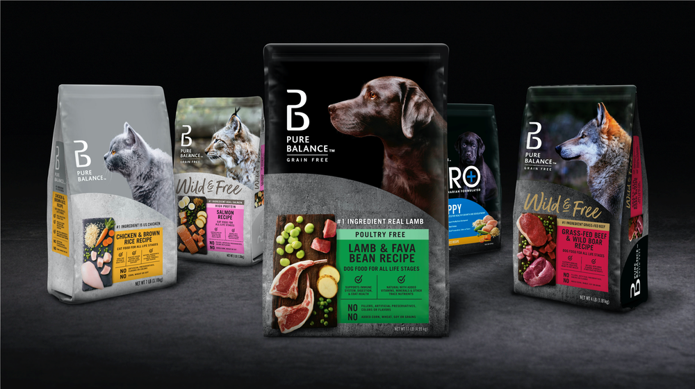
Navigating the Refrigeration Divide: Exploring Ambient Crossovers in Brand Expansion

The Evolution and Future of Plant-Based: Navigating the Peaks and Valleys
2023 ‘unwrapped’ – another year of creativity and change

What is Sunrise 2027 and how can brands prepare for it?
People Power and Private Brand – Global Creative Director Michael Duffy’s End of Year Review

Tidings of Comfort and Joy: Our Predictions For This Year’s Festive Trends

What pet food trends should producers focus their development efforts on in 2023/24?
Recent
Celebrating Together: Equator’s Milestone with West Michigan and Minneapolis Offices Integration
Hello to our incredible community! We’re thrilled to share a momentou...
Navigating the Refrigeration Divide: Exploring Ambient Crossovers in Brand Expansion
In the ever-evolving landscape of consumer goods, brands are continually se...
The Evolution and Future of Plant-Based: Navigating the Peaks and Valleys
Has Plant Peaked? In recent years, the plant-based movement has experienced...
2023 ‘unwrapped’ – another year of creativity and change
With 2024 finally upon us, it comes a time to look back and reflect on anot...
What is Sunrise 2027 and how can brands prepare for it?
Throughout history, finding new and better ways of doing things has been a ...
People Power and Private Brand – Global Creative Director Michael Duffy’s End of Year Review
With the end of the year fast approaching, I’ve found myself reflecting o...
Tidings of Comfort and Joy: Our Predictions For This Year’s Festive Trends
At Equator, we use every tool at our disposal to identify, analyse and pred...
What pet food trends should producers focus their development efforts on in 2023/24?
As a design agency that frequently handles innovative pet food packaging pr...
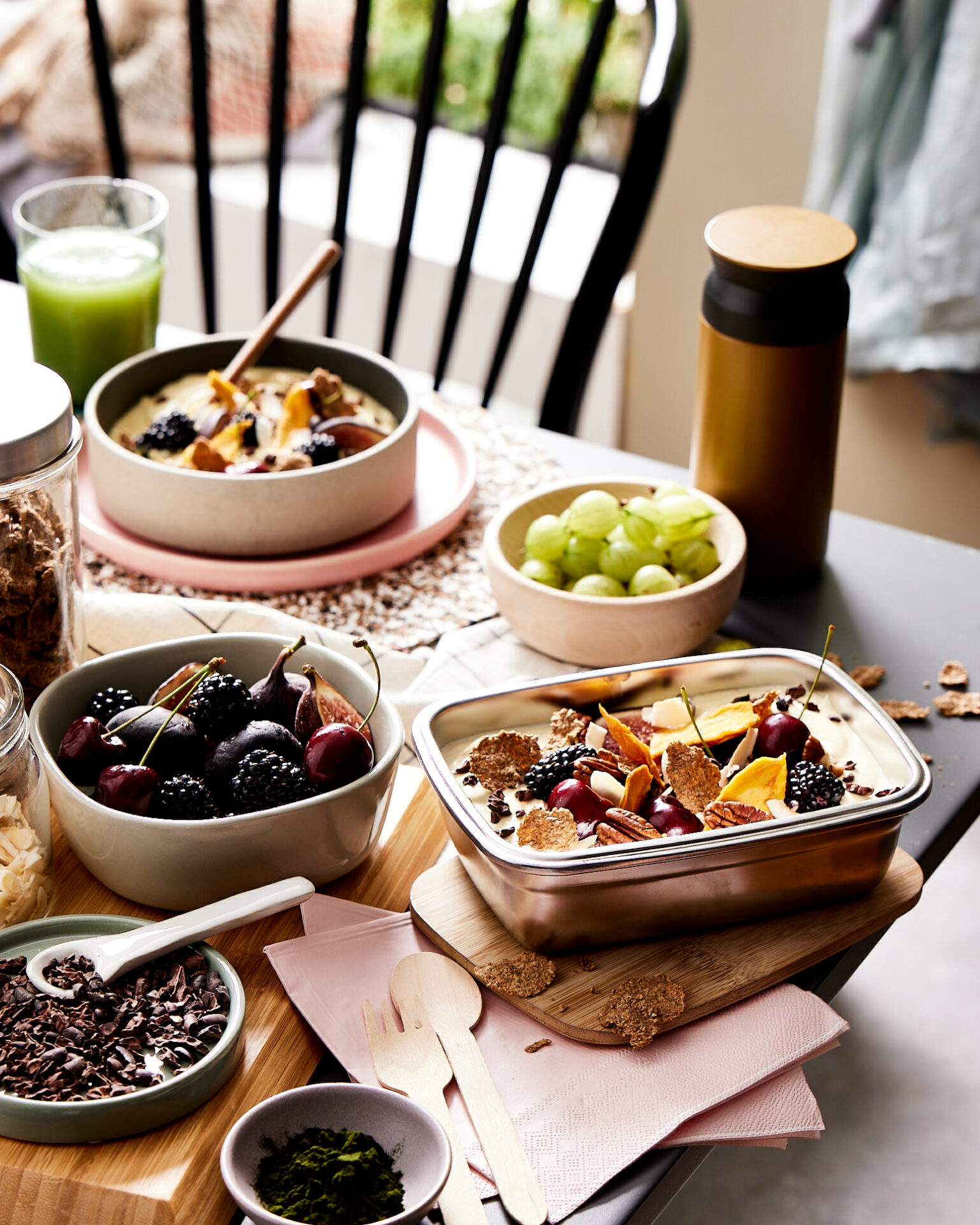
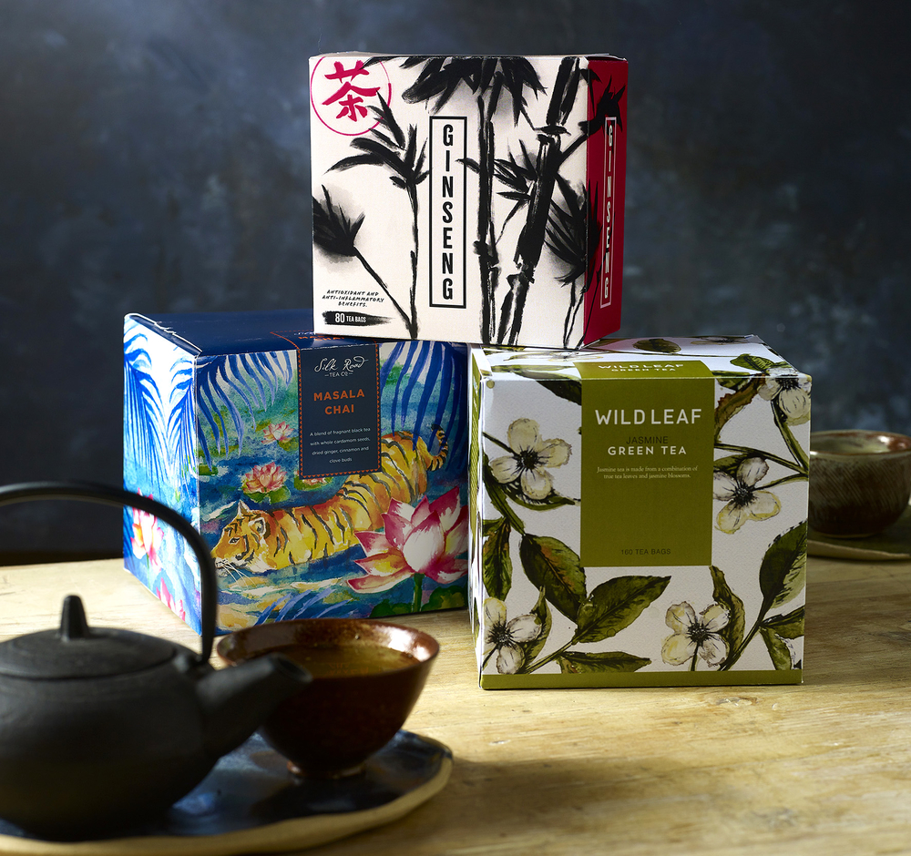
Exploring the Culinary Delights Shaping Our Food Choices
As we find ourselves immersed in the fourth month of 2024, the culinary jou...
Equator Manchester designer volunteers to create a smashing new logo for Leeds Powerchair FC
Leeds Powerchair FC, one of the leading powerchair football clubs in West Y...
What is Sunrise 2027 and how can brands prepare for it?
Throughout history, finding new and better ways of doing things has been a ...

Carbon Footprint on packaging design: Customers demand clearer info on sustainability
You may have already spotted eco-labelling on product packaging design at y...
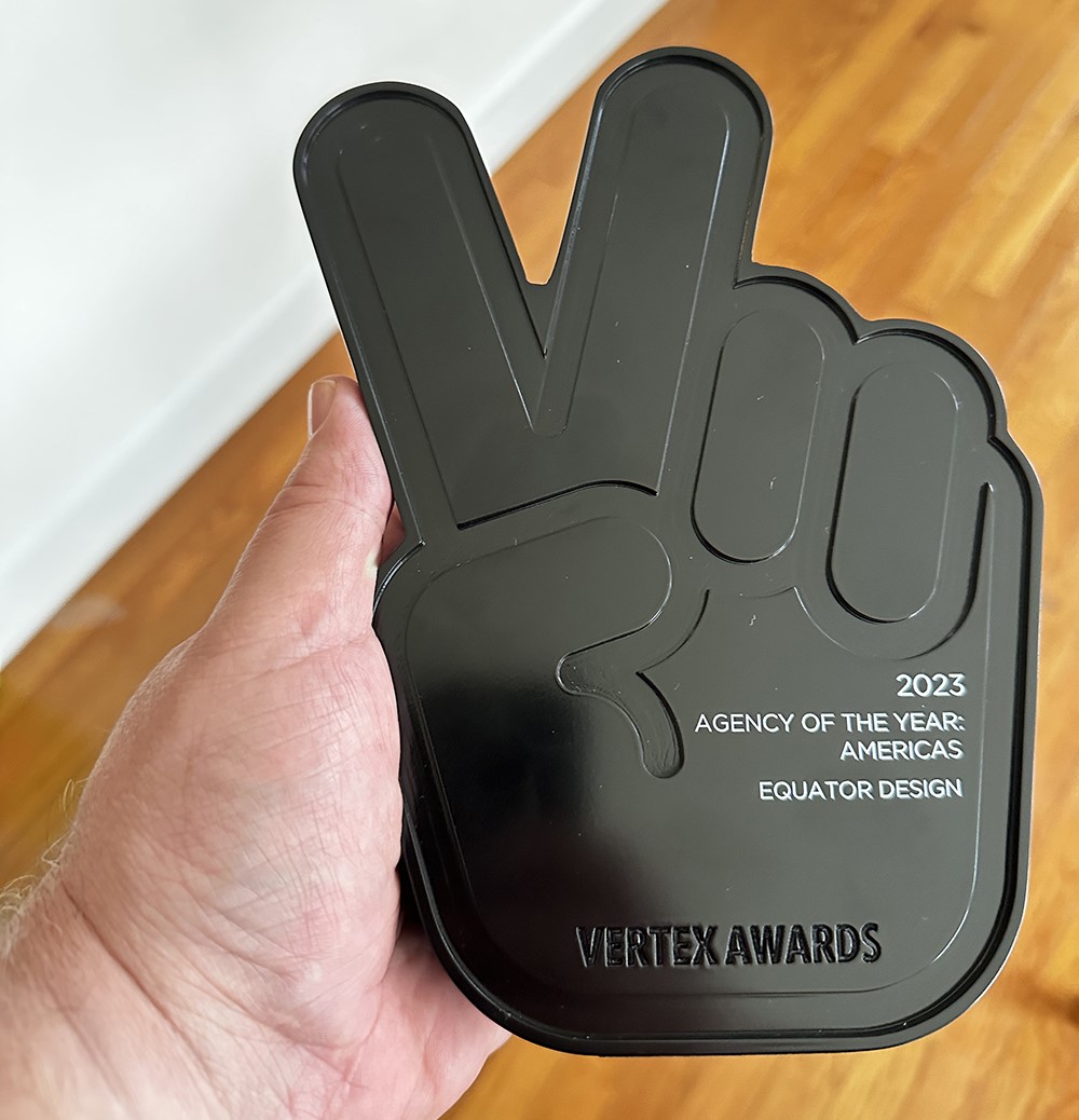
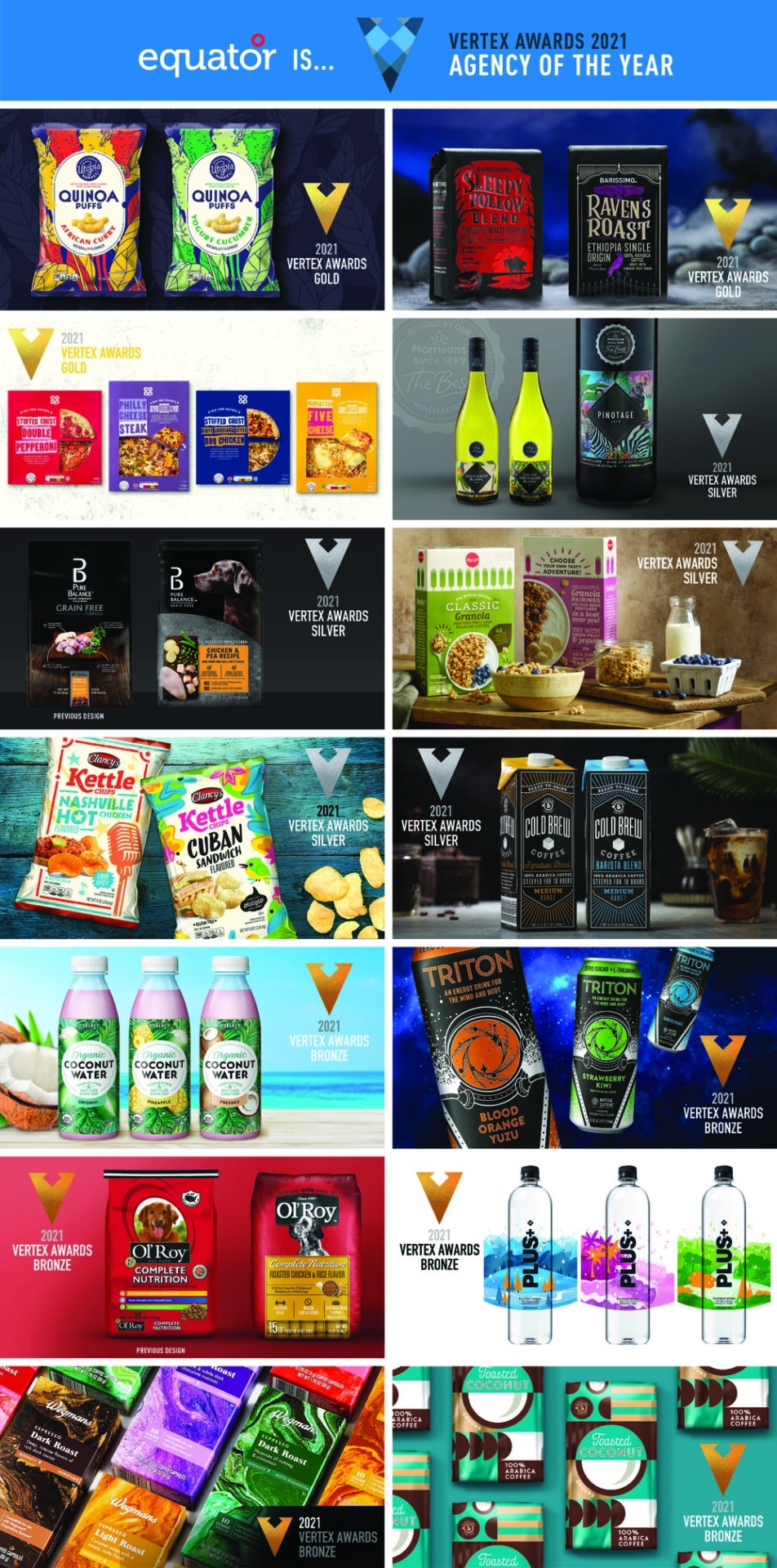
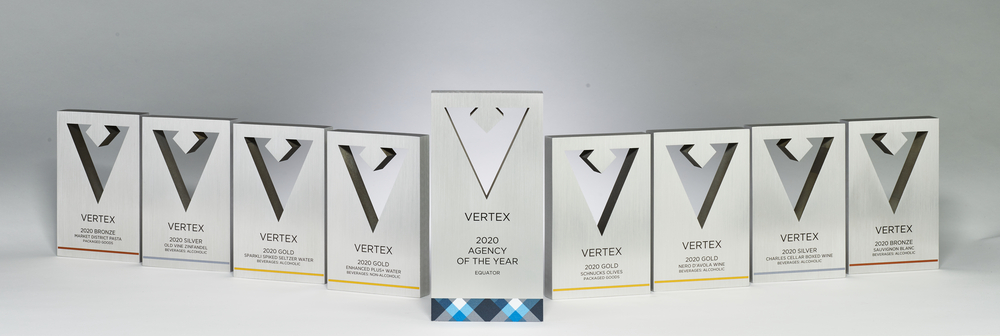
Equator takes home TEN private brand design wins at 2023 Vertex Awards
That’s right, team; we’re delighted to reveal that your hard work won u...
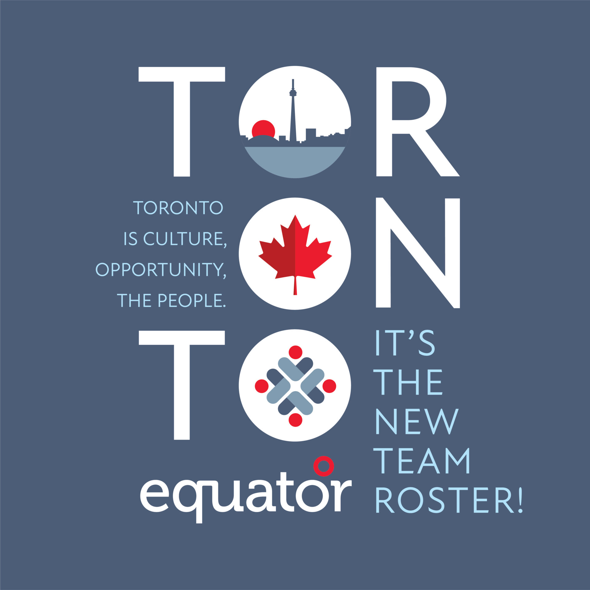
Equator announces Toronto studio opening
Our award-winning global packaging design agency has proudly opened a new s...
Combatting decision fatigue: a guide for private brands
If the world is beleaguered by change and uncertainty, then so too are shop...
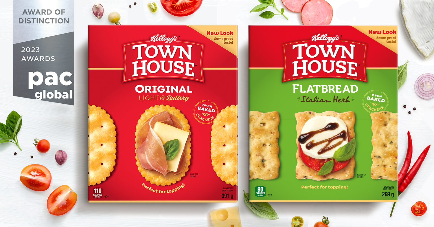
Success at PAC Global Awards for Equator’s Canadian Contingent
A huge congratulations to our new colleagues in Canada for th...
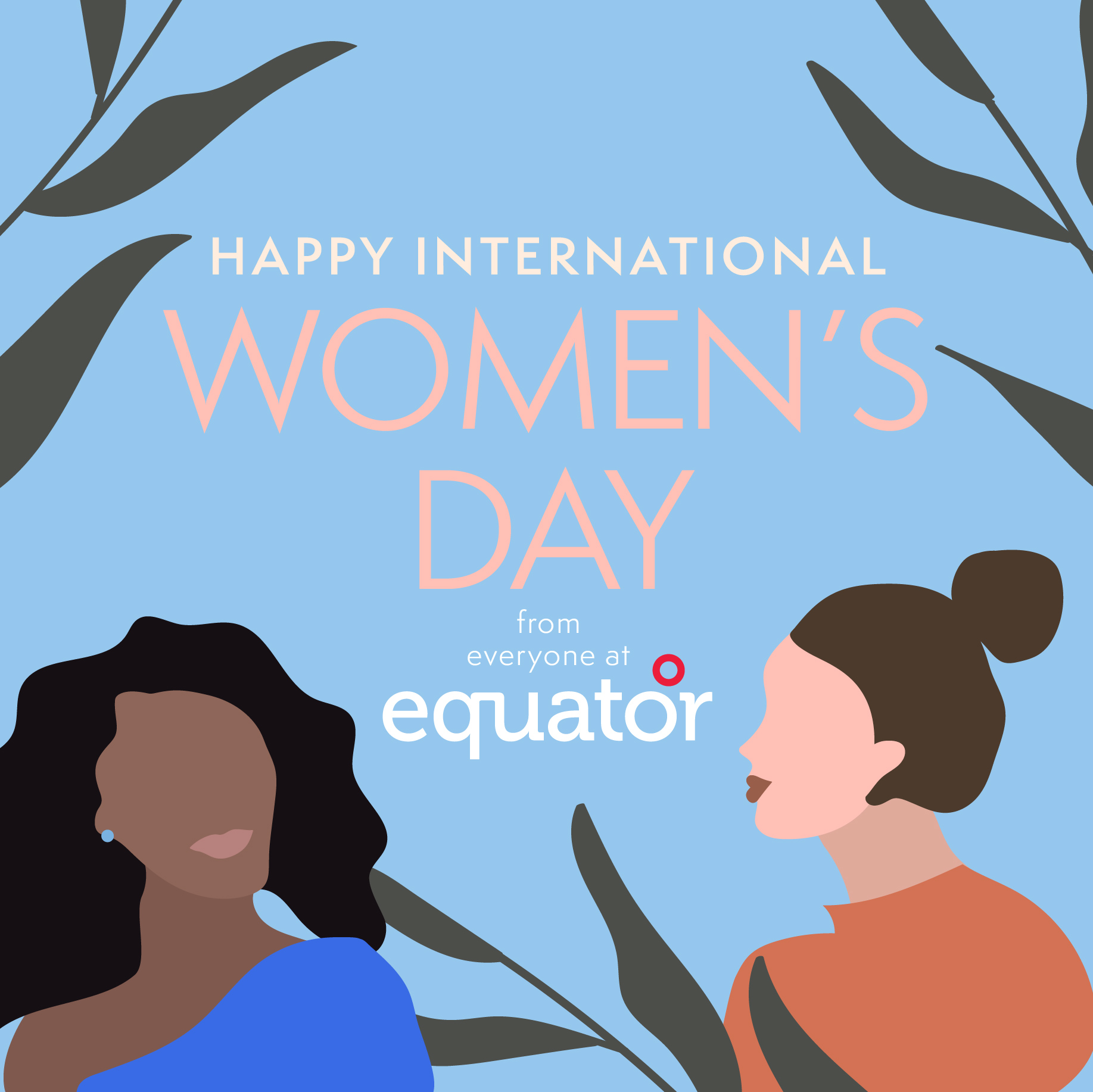
International Women’s Day 2023
Today is International Women’s Day (IWD), a global event held annually on...
Your brand and the Metaverse: what you need to know
If not, or if you’re unsure what the Metaverse even is, now might be the ...
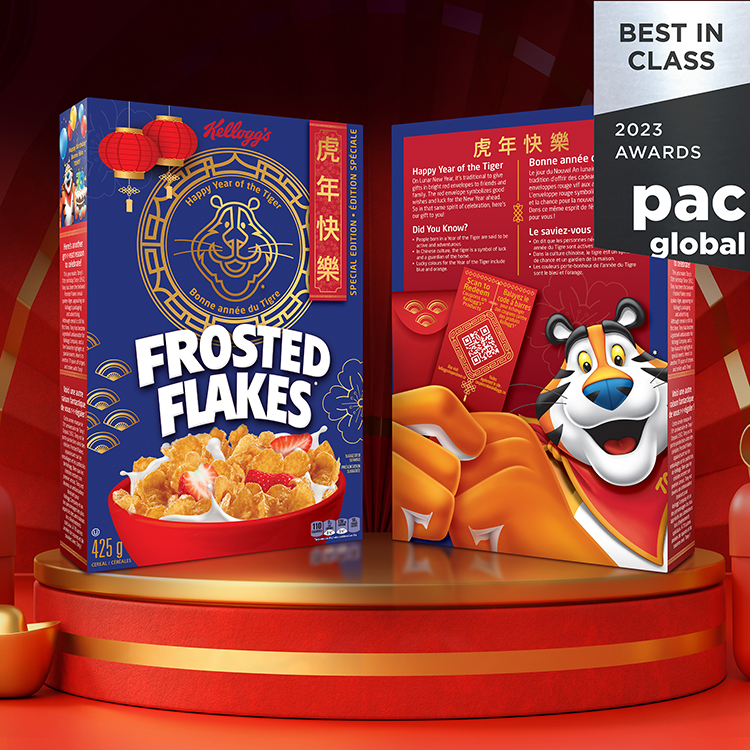
Success at PAC Global Awards for Equator’s Canadian Contingent
A huge congratulations to our new colleagues in Canada for their fantastic ...

What to expect in 2023 – a further look at packaging & branding trends…
Welcome back to the Equator crystal ball, where we look into the future and...
What’s hot for 2023?
What’s so important about packaging trends right now? Well, paying attent...
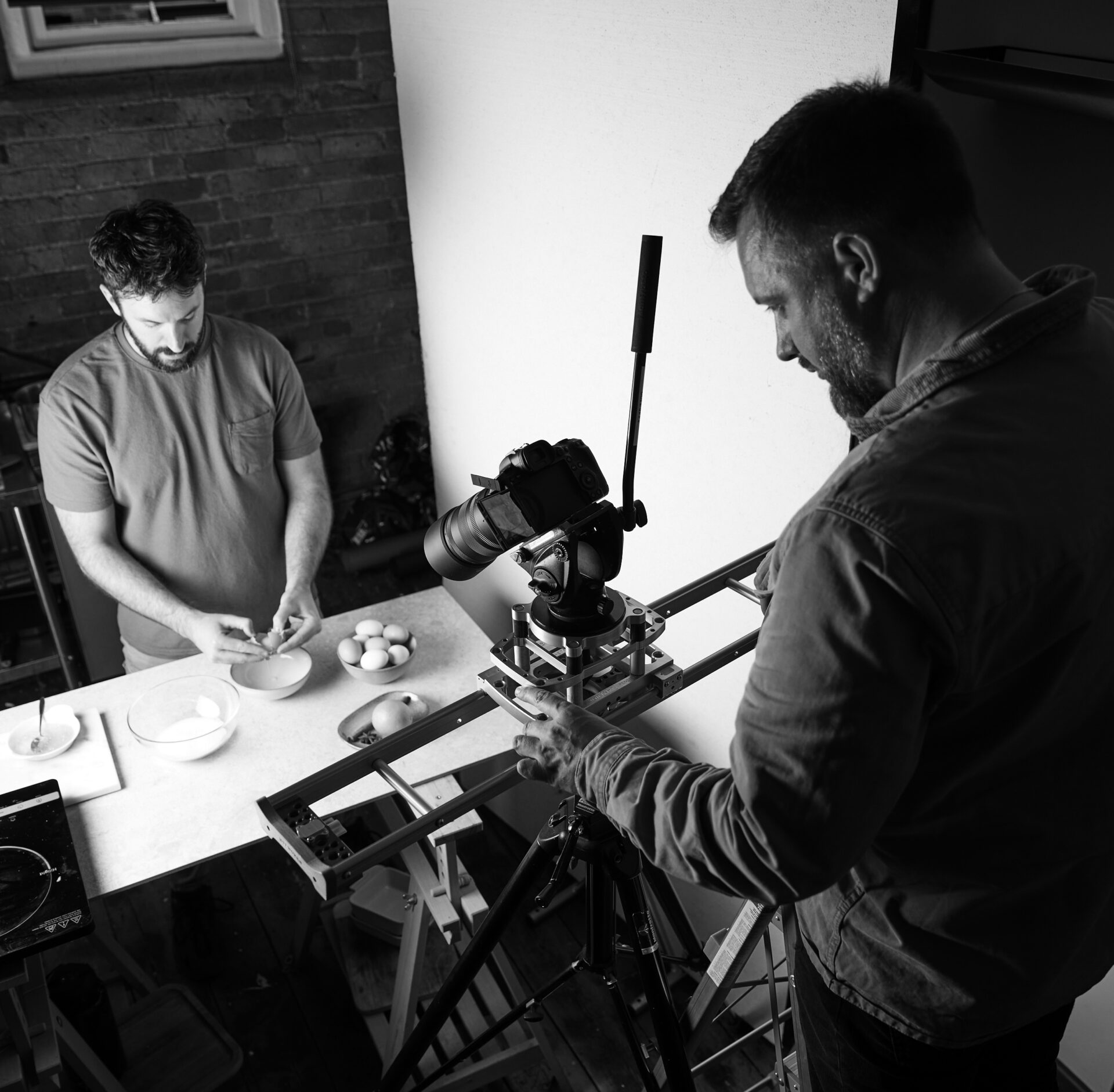
The 3 factors set to propel Equator in-house photography to new heights
There’s a palpable undercurrent of anticipation bubbling away within the ...
When disruption hits – how do you hold on to your customers?
Supply chain resilience will be a major focus both on the part of retailers...

Who is the ‘future consumer’?
If there has been one certainty of the last couple of years, it’s that of...
Celebrating Manchester’s Proud History
The fabric of Manchester’s history is weaved of several major social, pol...
Bringing home the bacon: the importance of brand and packaging in food retail.
What is it about packaging that makes a consumer pick one product over anot...

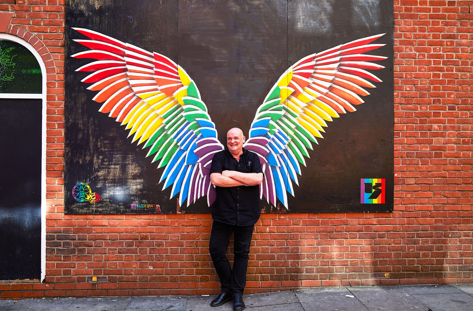
Shining a light on LGBTQ+ iconography
As a creative business, we pride ourselves on being at the heart of what pe...

What are the secrets to being “instagrammable”?
Social shopping is a rapidly accelerating section of e-commerce. In fact, a...

Spotlight – A Look Back at the Spring Series
The D&I Council’s Spring edition of its new bulletin, Spotlight, was ...
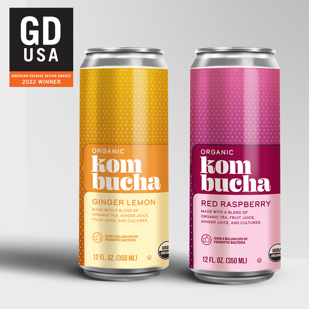
EQUATOR SCOOPS FIVE WINS AT GDUSA PACKAGE DESIGN AWARDS
This year, there were 2,750 entries to the Graphic Design USA (GDUSA) Packa...

DYNAMIC CAREER JOURNEYS: HOW EQUATOR GROWS FROM WITHIN
It’s well recognised that an expanding business is fertile ground for car...

HOW CAN PRIVATE BRANDS DRIVE SUCCESS IN 2022? TED MONNIN, SENIOR CREATIVE DIRECTOR, TAKES A LOOK AT THE EVER CHANGING LANDSCAPE OF PRIVATE BRAND AND HOW THINGS COULD PLAY OUT THIS YEAR.
Between the pandemic’s disruptive effect on supply chains and the rising ...

EQUATOR APPOINTS SI THOMPSON AS UK DIRECTOR OF PHOTOGRAPHY IN MANCHESTER
Equator has appointed Si Thompson as UK director of photography at its Manc...
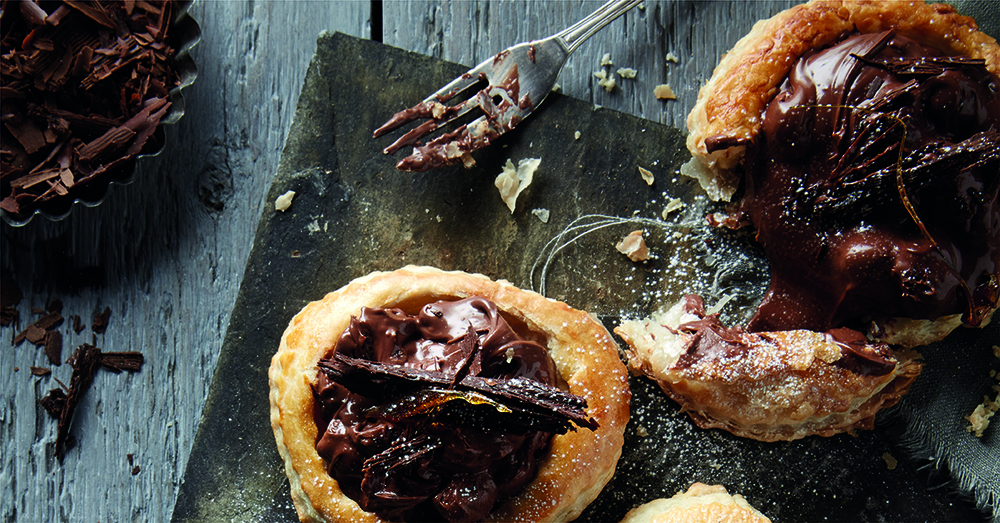
HARD-WIRED FOR INDULGENCE
Although he may not be related to the founders of the historic Funke Chocol...

REUSABLES AND REFILL STATIONS: WHAT “PACKAGING FREE” MEANS FOR NATIONAL AND PRIVATE BRANDS
The city of Glasgow has been playing host to the COP26 UN Climate Conferenc...

BACK TO SCHOOL: A COLOSSAL OPPORTUNITY FOR BIG, BOLD BRANDS
It’s hard to ignore the pandemic-related shockwaves that keep rippling th...
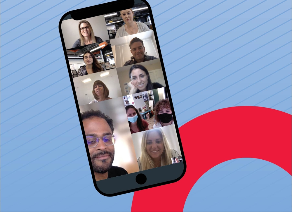
COLLABORATING IN THE TIME OF CORONAVIRUS: EQUATOR’S CHANGES FOR THE BETTER
Running a business during a pandemic is a task fraught with challenges –�...

SOMETIMES TAKING SOMEONE’S WORD FOR IT JUST ISN’T ENOUGH. WE NEED TO SEE AND EXPERIENCE THINGS FOR OURSELVES IN ORDER TO BELIEVE IN THEM.
Customers feel this way, which is why they are demanding more windows into ...

DO THE LEGWORK FOR CUSTOMERS ONLINE… OR RISK THEM GETTING ITCHY FEET
Covid has sent customers exploring new brands and services. Last year as ma...
EQUATOR NAMED AS LARGE AGENCY OF THE YEAR 2021 AND SCOOP 14 VERTEX AWARDS
Equator has been named as Large Agency of the Year 2021 for the second year...
PRIVATE BRAND SEGMENTATION STRATEGIES
As the US private brand marketplace matures, more private brands are using ...
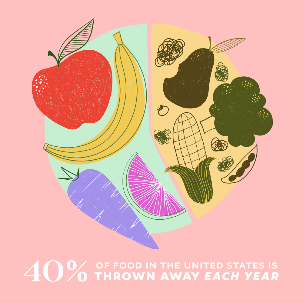
WHY AND HOW BRANDS SHOULD BE HELPING CONSUMERS TACKLE THEIR FOOD WASTE HABITS
Creative Director, Glyn Robinson chats about how both consumers and brands...

FOCUS GROUP METHODOLOGY
Like so many industries, consumer research has made a lightning-fast pivot ...

PAUSE TO GET READY – WHY RESEARCH IS CRUCIAL NOW AS LIFESTYLES SHIFT AND BUSINESSES READY TO HIT THE ACCELERATOR
As vaccine distribution numbers rise and R-numbers fall, we as individuals ...

PACK FRONTS IN 2021: THESE ARE THE TRENDS TO WATCH…
Trends are constantly emerging and fading, and sometimes – as in the case...
PRIVATE BRANDS & CUSTOMER JOURNEY: CLAIMING A STAKE IN THE ECOMMERCE BOOM
Phil Jones, VP Client Engagement & Operations chats to us about the Ecommer...

THE HIGH-TECH PACK FRONT: HOW DIGITALLY DRIVEN PROCESSES IMPROVE COLOUR CONSISTENCY AND CUSTOMER EXPERIENCES
Gary Moore, Group Colour Manager looks at the importance of colour consiste...
WHAT MAKES YOUR DIGITAL SHELF WORTH SHOPPING?
As individuals and businesses we are still in the thick of it, dealing with...

YOU SAY YOU WANT A REVOLUTION: PLASTICS IN A POST-COVID WORLD
COVID-19 triggered a global surge in plastics consumption… can we work to...

“OMNICHANNEL” – EVERYONE IS SAYING IT, BUT WHAT IS IT?
Todd Schneider, Account Director, shares his views on omnichannel retailing...
THE BIG NIGHT IN: HOW THE “HOMEBODY ECONOMY” IS TRANSFORMING THE RETAIL LANDSCAPE
With nearly all of us now spending much more time at home, the new value pl...

DOES YOUR PRIVATE BRAND HAVE A COMMITMENT PROBLEM?
Todd Schneider, Account Director, shares his views on getting customers to ...

SIGNS OF THE TIMES: IS AN EVER-SHIFTING LOGO A METAPHOR FOR THE LIVES WE LEAD TODAY?
At Equator we talk a good deal about “locking in” a logo, and we use th...
KEY POINTS FROM VELOCITY GLOBAL – THE FIRST-EVER GLOBAL PRIVATE BRAND EVENT, VIRTUALLY
Our own Ed Holden and Michael Duffy attended the event virtually, and here ...
PACKAGING RENDERS BRING BRANDS TO LIFE AND DRIVE PERFORMANCE BOTH IN-STORE AND ONLINE. HERE’S HOW…
We understand how infographic design, editorial photography and renders wor...
DESIGN WITH COMMUNITY IN MIND
Andreea Grosanu who heads up our Sydney operation talks about how we design...

EQUATOR DESIGN’S GLOBAL VP OF ENGAGEMENT MATT CALDWELL DISCUSSES LESSONS FROM THE COVID-19 CRISIS
The FMCG sphere is facing “seismic shifts” – have you felt them, or a...
EQUATOR ON BRAND MANIFESTOS: WHY, HOW AND WHEN TO REFRESH YOURS…
Ed Holden, VP of Business Development, walks us through Equator’s approac...

THE ROLE OF PRODUCTION IN BRAND GUARDIANSHIP
Rod joined the US team early in its history after he relocated back to the ...
THE COLOUR OF WATER
Six Equator designers recently sat down for a watercolour workshop led by C...
WHICH TRENDS IN BRANDING AND PACKAGING WILL PREVAIL IN 2020?
We discuss colour and style trends on the rise, plus the technological adva...
No results.